Material Design In XAML Toolkit Turns Two Years Old
On 1st February 2017 Material Design In XAML marks it’s 2nd year since it appeared on GitHub. Right up front I have to apologise for all the bugs I haven’t fixed. Plenty of people are helping out, but the project can only move so fast. I always try to prioritise API quality over cramming in more fixes and updates. Hopefully this shows, as I feel that on the whole the library is easy to use, robust, and ultimately helps make apps look great.
It’s been a busy, successful, and rewarding two years. Sometimes frustrating, always educational. I’m continually dealing with users over email, Twitter, GitHub, Gitter; it’s now got to the point where support is probably 75% of the time I spend on the project. Surely the biggest highlight for me was getting a Microsoft MVP award off the back of this work (and Dragablz), and traveling to Seattle for the MVP Summit. It was great to meet so many people I’ve got to know on GitHub and Twitter.
Two years in I’d like to share some stats on this project. .Net itself is undergoing major open source shakeup, with a big emphasis on the web/ASP side of things. WPF is perhaps more of a “niche” tech, and may not be the bleeding edge XAML platform a anymore, but still has plenty of use, and the some of these stats illustrate the continuing popularity of WPF and the growing popularity of the toolkit:
Nuget downloads: 84,839
Average Nuget downloads per day: 118
GitHub stars: 2,340
GitHub forks: 4734
GitHub average views per day: 1675
GitHub average unique visitors per day: 319
Website average unique visitors per day: 177
Gitter chat room users: 300+ users
Two years ago, all these stats were a big fat zero. The trend has been upward ever since. I’ve seen and supported students, enterprises and hobbyists use the toolkit to help bring modern styling, palettes and UX flow to their desktop apps, and there are now
continually new projects appearing on GitHub referencing the library.
This isn’t a monster JavaScript framework, and is much smaller than friend, and big-brother WPF project, MahApps. But it’s healthy, and it’s growing.
Currently I’m focusing on “doobry”, a NoSQL editor for Azure DocumentDb. I feel this is becoming a great example of how to utilise Material Design In XAML on the desktop to create useful, attractive apps. Obviously there will be more to come for the toolkit itself over the next 12 months.
Thanks to all the users, contributors and everyone who has supported the library over the last 2 years!
I’ve been beavering away at a little website and decided – after a bit of investigation and then seeing Scott Guthrie talk at Azurecraft, London – to use DocumentDb for the data storage. At that point I didn’t have a massive amount of experience with NoSQL databases, but when I want to learn something I like to dive straight in, start coding, making mistakes, and hopefully come out the other side with some workable knowledge.
The website is node.js based, and I found the initial setup of DocumentDb pretty straight forward after running the the tutorials. I was up and running quickly, but I soon realised I wanted a tool for developing and testing queries, and playing around with my dev database. The Azure portal isn’t massively geared up for this. I saw one application, but even in this web/cloudy world I knew that with my arsenal of Material Design In XAML Toolkit and Dragablz libraries, I could throw together a desktop app to grease the gears of developing the web app.
Yesterday I published the first full alpha release of that effort. “doobry” is simple to use, yet slick and pretty feature rich. With it you can:
Edit and run SQL queries
Create, edit, copy and delete collection documents
Work with multiple databases
It’s open source, free to use, and an installer is available:
It’s also a great showcase of all the things you can do with Material Design In XAML and Dragablz, utilizing features such as:
Docking and layout persistance
Advanced dialogs
Transitions
Hopefully if you are using DocumentDb this tool will help you get along in your development and support tasks. And if you are developing WPF Material Design/Dragablz applications you might find some UX inspiration and helpful XAML techniques within the source.
After the prolonged release of 2.0, I promised to get back to shorter release cycles. So, despite the summer holidays 🙂 , here it is. I’ll keep this post short too. There’s a new Expander style, and various fixes.
This release of Material Design In XAML has taken way longer than I hoped, and contains less than I had hoped, so I apologise for that. I’m trying to follow SemVer, and a couple of breaking changes meant it was time to tick over to v2. Up until now I’ve been keeping to small, regular releases, but knowing it was time to go to v2 I thought I’d go for a big, showcase release. I failed. In assigned issues to the milestone I bit off way more than I could chew, even with the help of my (awesome) contributors.
I read a tweet a while back saying someone couldn’t trust an open source library as the versions had ticked up high; indicating API instability. There’s no doubt some truth in that, but in holding back a release (maybe so you can batch together several API changes) you start encountering the pitfalls of those longer release cycles. Remember, that most open source projects are side projects, and time can be in short supply. To be honest, I became a bit disheartened because I started realising I couldn’t deliver everything I wanted in this release.
So, I decided to draw a line under what we’ve got, roll the release, and get back to the shorter release cycles. I try hard to keep the public surface of the library stable, but in the future, when it’s time to move, I will move more quickly. Even if it means ticking over SemVer more regularly.
The good news. The release is still pretty awesome. New Chip controls, new Toggle styled listboxes, and many other enhancements. Also, I’ve been privileged to receive a Microsoft MVP award for Windows Development. I’m pretty stoked about this, it’s definitely nice to get some recognition for the open source journey I’ve been on over the last few years. A big thanks is owed to everyone that’s helped this library grow and become something referenced in a lot of WPF systems.
Version 2.0 is now up on nuget. Download and enjoy!
So yeah, this isn’t directed at people doing cool Flux models with React.js, no, this is for those of use still plying the MVVM pattern with rich clients using XAML.
I hate “ViewModelBase”. “NotifyPropertyChangedBase”. Whatever. The basic thinking is, yeah, we do this a lot, let’s make a base class with all our common view model stuff. Whatever. I hate it. Inheritance, is in most part, a trouble-making aspect of object orientation which for many cases can be avoided.
Composition makes your objects much more malleable, and this applies as much to your view model as elsewhere.
So yeah, it might cost a line or two extra, but we have CallerMemberName, and with C# 6.0 the amount of code required to implement OnPropertyChanged is minimal:
But even so, enforcing an inheritance chain for this? Pah. Not interested. I’ve see so many large enterprise systems creaking at their foundations due to cumbersome inheritance models that I just wont bother. If you really want to encapsulate the check ‘n’ raise code, how about using an extension instead? Something like this:
public static class NotifyPropertyChangedExtension
{
    public static void MutateVerbose<TField>(this INotifyPropertyChanged instance, ref TField field, TField newValue, Action<PropertyChangedEventArgs> raise, [CallerMemberName] string propertyName = null)
    {
        if (EqualityComparer<TField>.Default.Equals(field, newValue)) return;
        field = newValue;
        raise?.Invoke(new PropertyChangedEventArgs(propertyName));
    }
}
This means in your view model, yeah – you’ll have to declare the event, but I’ll take that one line over inheritance any day, and the final result is still pretty succinct:
public sealed class ViewModel : INotifyPropertyChanged
{
    private string _name;

    public string Name
    {
        get { return _name; }
        set
        {
            this.MutateVerbose(ref _name, value, args => PropertyChanged?.Invoke(this, args));
        }
    }

    public event PropertyChangedEventHandler PropertyChanged;
}
I’m happy to say that Material Design In XAML Toolkit version 1.2 has rolled, bringing yet more polish and features that are hopefully going to help people bring their desktop applications to life.
The DialogHost control provides Material Designed themed popups and also provides a comprehensive API to deal with popup dialogs, which have traditionally been a pain point for WPF developers. This release polishes some of the API for both MVVM and code-behind scenarios. Some great community testing has helped round this off, and also some code comes from here.
Thanks to all contributors for helping to not only move this project forward, but also helping drive its success; it’s really exciting how much traction this library has gained since I started it.
Coming Next
For 1.3 I’ve already started working on a “Multiple Floating Action Button” which is quite common on Android, and there will be a few smaller tweaks. Also, as ever, I’ll be plugging away at Dragablz as I try and approach a version 1.0. UWP stuff? Still a pet project at the moment 🙂
In a previous post I showed Dragablz and MahApps working together with a few basic pointers. In this post I will illustrate the specific MahApps styles included in Dragablz, and show how to get a basic app shell up and running using both libraries.
So, starting from scratch, create a new WPF Application in Visual Studio. Throw a TabControl into your app.
If you fire it up, you’ll see it looks like tripe. And it’s static. To bring the tab control to life get Dragablz installed. Either from the Package Manager Console or the Manage Nuget Packages dialog install Dragablz.
Install-Package Dragablz
Switcheroo our boring old TabControl to the TabablzControl, and add an InterTabController property to let Dragablz know that the user can tear tabs out:
If you fire up the application now you should be able to tear the tabs out.
But it most definitely still looks rubbish. We need styles. Again, use your NuGet delivery mechanism of choice to bring in MahApps.Metro.
Install-Package MahApps.Metro
MahApps handy QuickStart guide should popup in Visual Studio. If it doesn’t, check here. Follow the guide. In summary we need to convert our Window to the MetroWindow, and add a include few ResourceDictionary instances in the App.xaml.
Fire the application up, take a look. Things are improving:
MahApps Window with default-styled TabablzControl
We have a metro/modern UI Window and button. But the tab control is yet to receive a makeover. You should already made the relevant MahApps ResourceDictionary inclusions in the App.xaml. Now we need to bring in the Dragablz ResourceDictionary which contains the MahApps styles, and specify the default style for the DragablzTabControl, giving you an App.xaml which looks like:
If you fire up the application you will see the tab control is now coloured according to the MahApps accent defined in the App.xaml.
MahApps Window with themed TabablzControl
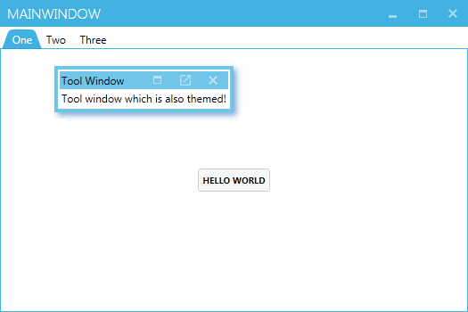
As a bonus, let’s add a Dragablz tool window to the Window, which can also be themed with MahApps colours. Switch back to MainWindow.xml, wrap the TabablzControl in a Layout (notice the FloatingItemContainerStyle property), and add a simple floating item to the Layout:
And here will be your final result, a MahApps Window, ready for all your Metro/Modern UI content, which can also support tear-able tabs, tool windows, and docking!
In a future post I will illustrate how to add and remove tabs, and work in a MVVM environment.
Dragablz now provides its own window, “DragablzWindow”. Please note, it is not mandatory – and is still very much a work in progress!
What the Window will provide, is the ability to push the tabs up a bit, and even better, whatever padding is around the tab can become transparent whilst a tab is being dragged around, in a similar vein to IE. Check out the gif:
We all have our favourite IDE, and they all provide pretty advanced docking features. Many control libraries in WinForms, WPF, Swing etc have provided this functionality over the years. But are docking suites – which can be complex, fiddly beasts – designed by and for developers what other users really want?
Remember when Google first released Chrome? Tearing tabs out immediately felt so easy and natural I wondered why no-one had done it before. It was one of those UX paradigms that just works. So in designing the docking library for Dragablz I wanted to reduce the complexity of what we have come to expect and provide a UX experience that is much more easy and free flowing. I’ve tried this before on an enterprise application I have been working on and it’s pretty successful with the user base.
The gif below illustrates the simplicity of having quick, easy access dock “zones” that are easy to throw a tab into, instead of having more, smaller, fiddly areas which are harder to hit in traditional setups.
Easy Docking With Dockablz
There’s still a little way to go to polish up the code but the basics can be seen in the demo project in the main solution in GitHub.


 dragablz.net