
In a previous post I showed Dragablz and MahApps working together with a few basic pointers. In this post I will illustrate the specific MahApps styles included in Dragablz, and show how to get a basic app shell up and running using both libraries.
So, starting from scratch, create a new WPF Application in Visual Studio. Throw a TabControl into your app.
<Window x:Class="WpfApplication1.MainWindow"
        xmlns="http://schemas.microsoft.com/winfx/2006/xaml/presentation"
        xmlns:x="http://schemas.microsoft.com/winfx/2006/xaml"
        xmlns:dragablz="clr-namespace:Dragablz;assembly=Dragablz"
        Title="MainWindow" Height="350" Width="525">
    <TabControl>
        <TabItem Header="One">
            <Button HorizontalAlignment="Center" VerticalAlignment="Center">Hello World</Button>
        </TabItem>
        <TabItem Header="Two">
            <Button HorizontalAlignment="Center" VerticalAlignment="Center">How are you doing</Button>
        </TabItem>
        <TabItem Header="Three">
            <Button HorizontalAlignment="Center" VerticalAlignment="Center">Goodbye</Button>
        </TabItem>
    </TabControl>
</Window>
If you fire it up, you’ll see it looks like tripe. And it’s static. To bring the tab control to life get Dragablz installed. Either from the Package Manager Console or the Manage Nuget Packages dialog install Dragablz.
Install-Package Dragablz
Switcheroo our boring old TabControl to the TabablzControl, and add an InterTabController property to let Dragablz know that the user can tear tabs out:
<Window x:Class="WpfApplication1.MainWindow"
        xmlns="http://schemas.microsoft.com/winfx/2006/xaml/presentation"
        xmlns:x="http://schemas.microsoft.com/winfx/2006/xaml"
        xmlns:dragablz="clr-namespace:Dragablz;assembly=Dragablz"
        Title="MainWindow" Height="350" Width="525">
    <dragablz:TabablzControl>
        <dragablz:TabablzControl.InterTabController>
            <dragablz:InterTabController />
        </dragablz:TabablzControl.InterTabController>
        <TabItem Header="One">
            <Button HorizontalAlignment="Center" VerticalAlignment="Center">Hello World</Button>
        </TabItem>
        <TabItem Header="Two">
            <Button HorizontalAlignment="Center" VerticalAlignment="Center">How are you doing</Button>
        </TabItem>
        <TabItem Header="Three">
            <Button HorizontalAlignment="Center" VerticalAlignment="Center">Goodbye</Button>
        </TabItem>
    </dragablz:TabablzControl>
</Window>
If you fire up the application now you should be able to tear the tabs out.
But it most definitely still looks rubbish. We need styles. Again, use your NuGet delivery mechanism of choice to bring in MahApps.Metro.
Install-Package MahApps.Metro
MahApps handy QuickStart guide should popup in Visual Studio. If it doesn’t, check here. Follow the guide. In summary we need to convert our Window to the MetroWindow, and add a include few ResourceDictionary instances in the App.xaml.
Fire the application up, take a look. Things are improving:

We have a metro/modern UI Window and button. But the tab control is yet to receive a makeover. You should already made the relevant MahApps ResourceDictionary inclusions in the App.xaml. Now we need to bring in the Dragablz ResourceDictionary which contains the MahApps styles, and specify the default style for the DragablzTabControl, giving you an App.xaml which looks like:
<Application x:Class="DMGMD.App"
             xmlns="http://schemas.microsoft.com/winfx/2006/xaml/presentation"
             xmlns:x="http://schemas.microsoft.com/winfx/2006/xaml"
             xmlns:dragablz="clr-namespace:Dragablz;assembly=Dragablz"
             StartupUri="MainWindow.xaml">
    <Application.Resources>
        <ResourceDictionary>
            <ResourceDictionary.MergedDictionaries>
                <ResourceDictionary Source="pack://application:,,,/MahApps.Metro;component/Styles/Controls.xaml" />
                <ResourceDictionary Source="pack://application:,,,/MahApps.Metro;component/Styles/Fonts.xaml" />
                <ResourceDictionary Source="pack://application:,,,/MahApps.Metro;component/Styles/Colors.xaml" />
                <ResourceDictionary Source="pack://application:,,,/MahApps.Metro;component/Styles/Accents/Blue.xaml" />
                <ResourceDictionary Source="pack://application:,,,/MahApps.Metro;component/Styles/Accents/BaseLight.xaml" />

                <ResourceDictionary Source="pack://application:,,,/Dragablz;component/themes/mahapps.xaml" />
            </ResourceDictionary.MergedDictionaries>

            <Style TargetType="{x:Type dragablz:TabablzControl}" BasedOn="{StaticResource MahAppsTabablzControlStyle}" />

        </ResourceDictionary>
    </Application.Resources>
</Application>
If you fire up the application you will see the tab control is now coloured according to the MahApps accent defined in the App.xaml.

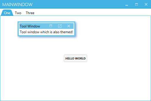
As a bonus, let’s add a Dragablz tool window to the Window, which can also be themed with MahApps colours. Switch back to MainWindow.xml, wrap the TabablzControl in a Layout (notice the FloatingItemContainerStyle property), and add a simple floating item to the Layout:
<controls:MetroWindow x:Class="WpfApplication1.MainWindow"
        xmlns="http://schemas.microsoft.com/winfx/2006/xaml/presentation"
        xmlns:x="http://schemas.microsoft.com/winfx/2006/xaml"
        xmlns:dragablz="clr-namespace:Dragablz;assembly=Dragablz"
        xmlns:controls="http://metro.mahapps.com/winfx/xaml/controls"
        xmlns:dockablz="clr-namespace:Dragablz.Dockablz;assembly=Dragablz"
        Title="MainWindow" Height="350" Width="525">
    <dockablz:Layout FloatingItemHeaderMemberPath="Header" FloatingItemDisplayMemberPath="Content"
                     FloatingItemContainerStyle="{DynamicResource MahAppsToolDragablzItemStyle}">
        <dockablz:Layout.FloatingItems>
            <dragablz:HeaderedItemViewModel Header="Tool Window" Content="Tool window shich is also themed!" />
        </dockablz:Layout.FloatingItems>
        <dragablz:TabablzControl>
            <dragablz:TabablzControl.InterTabController>
                <dragablz:InterTabController />
            </dragablz:TabablzControl.InterTabController>
            <TabItem Header="One">
                <Button HorizontalAlignment="Center" VerticalAlignment="Center">Hello World</Button>
            </TabItem>
            <TabItem Header="Two">
                <Button HorizontalAlignment="Center" VerticalAlignment="Center">How are you doing</Button>
            </TabItem>
            <TabItem Header="Three">
                <Button HorizontalAlignment="Center" VerticalAlignment="Center">Goodbye</Button>
            </TabItem>
        </dragablz:TabablzControl>
    </dockablz:Layout>
</controls:MetroWindow>
And here will be your final result, a MahApps Window, ready for all your Metro/Modern UI content, which can also support tear-able tabs, tool windows, and docking!
In a future post I will illustrate how to add and remove tabs, and work in a MVVM environment.
 dragablz.net
Nice, looking forward to part III.
Any chance of including an example of adding a usercontrol to the tabcontrol outside of xaml. So far this is the only point it falls down for me :S. Can’t seem to get the content to load in the tab when I add it from a button press etc.
Ok. Will try and get something up over the next few days.
I have already grappled with this one see https://github.com/RolandPheasant/TradingDemo. Look at TraderWindowModel. I create an observable collection for each window and allow dragablz to manage the adding and removing items in each observable collection. The binding from the view model to the view is done using the magic of data templates which is defined in app.xaml
The rest of the code in the class is using rx / dynamic data (my os project) to manage adding and selecting an item.
I have spoken to James who has also promised me an answer for whether this is the best way
Hiya…sorry haven’t got a blog post up yet, however it is possible. Download the source from GitHub and have a look in DragablzDemo.net45. In BoundExampleWindow.xaml I have created a DataTemplate for my SimpleViewModel (which makes up the source collection). Have a look at the MDI Demo tab, and where I create that in Boot:
new SimpleViewModel { Name = “MDI Demo”, SimpleContent = new MdiExample() },
MdiExample is a UserControl. Thus, a UserControl added via code.
…will get some more blogs up re. MVVM shortly, but you can drop by the chatroom if you have any questions:
https://gitter.im/ButchersBoy/Dragablz
James
Thanks I’ll give it a look.
How To include Optional Close Button In The Wpf Dragablz