.Net, C#, MahApps, Material Design, UI, Uncategorized, UX, WPF, xaml

Happy 2nd Birthday to Material Design In XAML

Happy 2nd Birthday!

Material Design In XAML Toolkit Turns Two Years Old

On 1st February 2017 Material Design In XAML marks it’s 2nd year since it appeared on GitHub. Right up front I have to apologise for all the bugs I haven’t fixed. Plenty of people are helping out, but the project can only move so fast. I always try to prioritise API quality over cramming in more fixes and updates. Hopefully this shows, as I feel that on the whole the library is easy to use, robust, and ultimately helps make apps look great.

birthdaycake

It’s been a busy, successful, and rewarding two years. Sometimes frustrating, always educational. I’m continually dealing with users over email, Twitter, GitHub, Gitter; it’s now got to the point where support is probably 75% of the time I spend on the project. Surely the biggest highlight for me was getting a Microsoft MVP award off the back of this work (and Dragablz), and traveling to Seattle for the MVP Summit. It was great to meet so many people I’ve got to know on GitHub and Twitter.

Two years in I’d like to share some stats on this project. .Net itself is undergoing major open source shakeup, with a big emphasis on the web/ASP side of things. WPF is perhaps more of a “niche” tech, and may not be the bleeding edge XAML platform a anymore, but still has plenty of use, and the some of these stats illustrate the continuing popularity of WPF and the growing popularity of the toolkit:

  • Nuget downloads: 84,839
  • Average Nuget downloads per day: 118
  • GitHub stars: 2,340
  • GitHub forks: 4734
  • GitHub average views per day: 1675
  • GitHub average unique visitors per day: 319
  • Website average unique visitors per day: 177
  • Gitter chat room users: 300+ users

Two years ago, all these stats were a big fat zero. The trend has been upward ever since. I’ve seen and supported students, enterprises and hobbyists use the toolkit to help bring modern styling, palettes and UX flow to their desktop apps, and there are now
continually new projects appearing on GitHub referencing the library.

This isn’t a monster JavaScript framework, and is much smaller than friend, and big-brother WPF project, MahApps. But it’s healthy, and it’s growing.

Currently I’m focusing on “doobry”, a NoSQL editor for Azure DocumentDb. I feel this is becoming a great example of how to utilise Material Design In XAML on the desktop to create useful, attractive apps. Obviously there will be more to come for the toolkit itself over the next 12 months.

doobry

Thanks to all the users, contributors and everyone who has supported the library over the last 2 years!

(Birthday Cake from https://material.uplabs.com/posts/happy-birthday-icon

Advertisement
.Net, C#, Design, Material Design, Uncategorized, UX, WPF, xaml

SemVer, MVP and finally, Material Design In XAML 2.0.

This release of Material Design In XAML has taken way longer than I hoped, and contains less than I had hoped, so I apologise for that.  I’m trying to follow SemVer, and a couple of breaking changes meant it was time to tick over to v2.  Up until now I’ve been keeping to small, regular releases, but knowing it was time to go to v2 I thought I’d go for a big, showcase release.  I failed.  In assigned issues to the milestone I bit off way more than I could chew, even with the help of my (awesome) contributors.

md-chips.png

I read a tweet a while back saying someone couldn’t trust an open source library as the versions had ticked up high; indicating API instability.  There’s no doubt some truth in that, but in holding back a release (maybe so you can batch together several API changes) you start encountering the pitfalls of those longer release cycles.  Remember, that most open source projects are side projects, and time can be in short supply.  To be honest, I became a bit disheartened because I started realising I couldn’t deliver everything I wanted in this release.

md-list-toggle.png

So, I decided to draw a line under what we’ve got, roll the release, and get back to the shorter release cycles.  I try hard to keep the public surface of the library stable, but in the future, when it’s time to move, I will move more quickly.  Even if it means ticking over SemVer more regularly.

MVP.jpg

The good news.  The release is still pretty awesome.  New Chip controls, new Toggle styled listboxes, and many other enhancements.  Also, I’ve been privileged to receive a Microsoft MVP award for Windows Development.  I’m pretty stoked about this, it’s definitely nice to get some recognition for the open source journey I’ve been on over the last few years.  A big thanks is owed to everyone that’s helped this library grow and become something referenced in a lot of WPF systems.

Version 2.0 is now up on nuget.  Download and enjoy!

The full release notes are on GitHub.

.Net, C#, coding, Design, Material Design, UX, WPF, xaml

Material Design In XAML – 1.5

It’s a big new release for MD in XAML Toolkit! This release focuses on a new transitions API (when I say API, I mean fully usable from XAML), which takes the pain out of WPF storyboard-ing, making animations on individual elements, and between whole “pages” easy.

Release page.

To showcase what can be done I’ve created an entirely new demo app. What’s great is that I was able to build version 1.0 of the demo app in less than a day. All the animations are “out of the box”; straight from Material Design In XAML Toolkit, with zero fiddling with WPF storyboards or animations (but yes, the extensibility is still there!)

It looks a bit like this:

main.gif

You can get your hands on the new demo at it’s new GitHub page.

On top of that there is also a small demo in the main Material Design In XAML Toolkit demo project.

To understand usage of the new transitions API, take a look at both demos and check out the wiki page.

I say this every release, but it’s always true, there have also been some great additions and fixes from the community (which is really growing nicely).  Full release details are here.

I guess with any software library it takes a while to gain traction, but this library is now just over a year old, seems to have plenty of users and I’m seeing some nice looking UIs appear.  With 1.5 I’m hoping for some nice animation flourishes!

Happy UXing!

James

P.S. n00b to Material Design In XAML Toolkit?  Check out the Getting Started guide.


C#, Design, MahApps, Material Design, UI, UX, WPF, xaml

Icon Pack – Material Design In XAML 1.4

New for release 1.4 of Material Design In XAML Toolkit is a full icon pack.  Icon design is a skill itself and finding or creating good icons when designing an application can be a time consuming task.   To help  in this regard I am pleased to announce that the entire Material Design Icons collection is now included in the library.

MaterialDesignIcons.png

It’s a  great collection, containing over 1,400 icons, including many of  the standard icons we see on Android phones and many more additional icons added by its own community.   It’s worthwhile heading over to the website to get an overview of the icons, and there’s a search feature to help  you track down the icon you’re after.

Using the icons in your WPF application is easy.  Assuming you’ve already installed Material Design In XAML Toolkit, the XAML is as simple as:


<materialDesign:PackIcon Kind="ShareVariant" />

To give you: share-variant-16.png

The icons are SVG based, so scale nicely:

<materialDesign:PackIcon Kind="ThumbUp" Height="24" Width="24" />
<materialDesign:PackIcon Kind="ThumbUp" Height="36" Width="36" />
<materialDesign:PackIcon Kind="ThumbUp" Height="48" Width="48" />

thumb-up-24.png  thumb-up-36.png  thumb-up-48.png

You can see the entire icon collection in the main demo application:

IconPack.png

MahApps

Furthermore, the base class for the icon has been added to ControlzEx (credit to @punker76 for this idea), so in the future you may well see MahApps use the same API for Modern Design Language icons, giving WPF developers a common, simple icon XAML syntax:

<materialDesign:PackIcon Kind="SomeMaterialIcon" />
<mahApps:PackIcon Kind="SomeModernIcon" />

Release Details

Various other fixes, enhancements, performance improvements have recently gone into the library.  Versions 1.3.1, 1.3.2, and now 1.4.0 contain some welcome community contributions.  To see details of all changes hit the Releases GitHub page.

.Net, C#, coding, Roslyn

Generate a C# Enum with Rosyln

I’m currently working on an Icon Pack for my Material Design library and need to generate an enum containing a list of all the icons.  Before you delve into this code you should know that the same result could no doubt be achieved using simple string manipulation in a lot less time.  But I took this as an opportunity to learn a little about Roslyn, so if that’s what you’re after then read on.

I set about creating a code template for the enum with the intention of using Roslyn to clear the dummy enum values out and re-populate the enum with a new list.  Sourcing the list of values is the easy part and not discussed here.

To begin with, this is my starting code template:

namespace MaterialDesignThemes.Wpf
{
    /// ******************************************
    /// This code is auto generated. Do not amend.
    /// ******************************************

    /// <summary>
    /// List of available icons for use with <see cref="Icon"/>.
    /// </summary>
    /// <remarks>
    /// All icons sourced from Material Design Icons Font - <see cref="https://materialdesignicons.com/"> - in accordance of 
    /// <see cref="https://github.com/Templarian/MaterialDesign/blob/master/license.txt"/>.
    /// </remarks>;
    public enum IconType
    {
        AutoGeneratedDoNotAmend
    }
}

First lesson.  If you want to do something similar, install the .Net Compiler Platform SDK.  Stupidly I didn’t do this until I had the code 75% complete.  The solution below looks pretty simple but as is oft the way, figuring it out was the hard part.  The Syntax Visualizer Visual Studio add-in included in the SDK would have got me there a lot quicker.

If I had of used the Visualizer in VS 2015 earlier (View > Other Windows > Syntax Visualizer), upon highlighting my above code template I would have seen this, which gives you a pretty good idea of what we’re working with:

SyntaxVisualizer

Second lesson.  The nuget package you are probably after is (took me a bit of digging to get the right one):

Microsoft.CodeAnalysis.CSharp.Workspaces

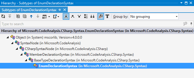
Also, I found ReSharper’s Hierarchy tool pretty useful to start understanding the class relationships; soon realising that we’re going to be spending a lot of time working with SyntaxNode objects and derivations thereof:

SyntaxNodeHierarchy

One of the first things to learn about Roslyn SyntaxNode objects is that they are immutable.  If you make a change then you’ll get a new one.  Obviously what we want to do is remove our AutoGeneratedDoNotAmend enum value (EnumMemberDeclarationSyntax) from the owning enum (EnumDeclarationSyntax) and replace it with a bunch of new members.  Meaning we’ll end up with a new enum/EnumDeclarationSyntax, in turn meaning we need to swap it out in the parent (NamespaceDeclaration) which again give us a new namespace, so we’ll have to swap that in the root’s children giving us a new root.  Effectively we start at the bottom and replace/renew everything walking up the ancestry of the tree.

Maybe there’s a better way, but this is my first crack at Roslyn and is very much a learning experience.

My first cut of the code (done prior to me installing the Visualizer/SDK, and using some pretend enum values) turned out like this:

private void UpdateEnum(string sourceFile)
{
    var sourceText = SourceText.From(new FileStream(sourceFile, FileMode.Open));
    var syntaxTree = CSharpSyntaxTree.ParseText(sourceText);

    var rootNode = syntaxTree.GetRoot();
    var namespaceDeclarationNode = rootNode.ChildNodes().Single();
    var enumDeclarationSyntaxNode = namespaceDeclarationNode.ChildNodes().OfType&amp;amp;amp;amp;amp;lt;EnumDeclarationSyntax&amp;amp;amp;amp;amp;gt;().Single();            

    var emptyEnumDeclarationSyntaxNode = enumDeclarationSyntaxNode.RemoveNodes(enumDeclarationSyntaxNode.ChildNodes().OfType&amp;amp;amp;amp;amp;lt;EnumMemberDeclarationSyntax&amp;amp;amp;amp;amp;gt;(), SyntaxRemoveOptions.KeepDirectives);
    var generatedEnumDeclarationSyntax = emptyEnumDeclarationSyntaxNode.AddMembers(
        SyntaxFactory.EnumMemberDeclaration("Aston"),
        SyntaxFactory.EnumMemberDeclaration("Villa"));

    var generatedNamespaceDeclarationSyntaxNode = namespaceDeclarationNode.ReplaceNode(enumDeclarationSyntaxNode, generatedEnumDeclarationSyntax);
    var generatedRootNode = rootNode.ReplaceNode(namespaceDeclarationNode, generatedNamespaceDeclarationSyntaxNode);

    Console.WriteLine(generatedRootNode.ToFullString());
}

The end result was pretty good, we retain the namespace declaration, comments, but we’ve lost something in the formatting:

namespace MaterialDesignThemes.Wpf
{
    /// ******************************************
    /// This code is auto generated. Do not amend.
    /// ******************************************

    /// <summary>
    /// List of available icons for use with <see cref="Icon"/>.
    /// </summary>
    /// <remarks>
    /// All icons sourced from Material Design Icons Font - <see cref="https://materialdesignicons.com/"> - in accordance of
    /// <see cref="https://github.com/Templarian/MaterialDesign/blob/master/license.txt"/>.
    /// </remarks>
    public enum IconType
    {
Aston,Villa    }
}

More digging and I learn how to create my enum member with “trivia” consisting of leading white space:

var leadingTriviaList = SyntaxTriviaList.Create(SyntaxFactory.Whitespace("        "));
var generatedEnumDeclarationSyntax = emptyEnumDeclarationSyntaxNode.AddMembers(
    SyntaxFactory.EnumMemberDeclaration(SyntaxFactory.Identifier(leadingTriviaList, "Aston", SyntaxTriviaList.Empty)),
    SyntaxFactory.EnumMemberDeclaration(SyntaxFactory.Identifier(leadingTriviaList, "Villa", SyntaxTriviaList.Empty)));               

Current result:

public enum IconType
{
    Aston,        Villa    }

This is good, but I now realised I needed to add a line feed, but to do this I needed the sibling “CommaToken” node to have the correct trailing trivia. I discovered this by tweaking my initial template to include two enum values and taking a look at the Syntax Visualizer:

SyntaxEnumComma

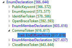
Yikes. This is starting to give me a headache.

Remembering that these toys we are playing with are immutable, I concocted a new method to pull all the comma tokens, and replace with new comma tokens with trailing line feed trivia:

. . .
generatedEnumDeclarationSyntax = AddLineFeedsToCommas(generatedEnumDeclarationSyntax);
. . .

private static EnumDeclarationSyntax AddLineFeedsToCommas(EnumDeclarationSyntax enumDeclarationSyntax)
{
    var none = new SyntaxToken();
    var trailingTriviaList = SyntaxTriviaList.Create(SyntaxFactory.ElasticCarriageReturnLineFeed);

    Func<EnumDeclarationSyntax, SyntaxToken> next = enumSyntax => enumSyntax.ChildNodesAndTokens()
        .Where(nodeOrToken => nodeOrToken.IsToken)
        .Select(nodeOrToken => nodeOrToken.AsToken())
        .FirstOrDefault(
            token =>
                token.Value.Equals(",") &&
                (!token.HasTrailingTrivia || !token.TrailingTrivia.Any(SyntaxKind.EndOfLineTrivia)));

    SyntaxToken current;
    while ((current = next(enumDeclarationSyntax)) != none)
    {
        enumDeclarationSyntax = enumDeclarationSyntax.ReplaceToken(current,
            SyntaxFactory.Identifier(SyntaxTriviaList.Empty, ",", trailingTriviaList)
            );
    }

    return enumDeclarationSyntax;
}

Our result now is looking much better:

namespace MaterialDesignThemes.Wpf
{
    /// ******************************************
    /// This code is auto generated. Do not amend.
    /// ******************************************

    /// <summary>;
    /// List of available icons for use with <see cref="Icon">.
    /// </summary>
    /// <remarks>
    /// All icons sourced from Material Design Icons Font - <see cref="https://materialdesignicons.com/"/> - in accordance of
    /// <see cref="https://github.com/Templarian/MaterialDesign/blob/master/license.txt"/>.
    /// </remarks>
    public enum IconType
    {
        Aston,
        Villa    }
}

There’s just that last curly bracket which needs knocking down a line, but I guess I’ll just have to get back to that…

.Net, C#, Uncategorized, UWP, WPF, xaml

ViewModelBase: go away.

So yeah, this isn’t directed at people doing cool Flux models with React.js, no, this is for those of use still plying the MVVM pattern with rich clients using XAML.

I hate “ViewModelBase”. “NotifyPropertyChangedBase”.  Whatever.  The basic thinking is, yeah, we do this a lot, let’s make a base class with all our common view model stuff.  Whatever.  I hate it.  Inheritance, is in most part, a trouble-making aspect of object orientation which for many cases can be avoided.

Composition makes your objects much more malleable, and this applies as much to your view model as elsewhere.

So yeah, it might cost a line or two extra, but we have CallerMemberName, and with C# 6.0 the amount of code required to implement  OnPropertyChanged is minimal:

private void OnPropertyChanged([CallerMemberName] string propertyName = null)
{
    PropertyChanged?.Invoke(this, new PropertyChangedEventArgs(propertyName));
}

I get that property change methods can get tedious.  I’ve seen this code about a lot: the “Set” method which checks equality and makes the change.

But even so, enforcing an inheritance chain for this?  Pah.  Not interested.  I’ve see so many large enterprise systems creaking at their foundations due to cumbersome inheritance models that I just wont bother.  If you really want to encapsulate the check ‘n’ raise code, how about using an extension instead?  Something like this:

public static class NotifyPropertyChangedExtension
{
    public static void MutateVerbose<TField>(this INotifyPropertyChanged instance, ref TField field, TField newValue, Action<PropertyChangedEventArgs> raise, [CallerMemberName] string propertyName = null)
    {            
        if (EqualityComparer<TField>.Default.Equals(field, newValue)) return;
        field = newValue;
        raise?.Invoke(new PropertyChangedEventArgs(propertyName));            
    }
}

This means in your view model, yeah – you’ll have to declare the event, but I’ll take that one line over inheritance any day, and the final result is still pretty succinct:

public sealed class ViewModel : INotifyPropertyChanged
{
    private string _name;

    public string Name
    {
        get { return _name; }
        set
        {
            this.MutateVerbose(ref _name, value, args => PropertyChanged?.Invoke(this, args));
        }
    }

    public event PropertyChangedEventHandler PropertyChanged;
}
.Net, C#, Design, Material Design, Uncategorized, UX, WPF, xaml

Material Design In XAML Toolkit: version 1.2

I’m happy to say that Material Design In XAML Toolkit version 1.2 has rolled, bringing yet more polish and features that are hopefully going to help people bring their desktop applications to life.

Links:

Key features of note:

ComboBox styling

This great PR as brought the combo style bang up to date with Google’s spec, and it looks great.

NewCombo

TimePicker goes 24 hour

24hrClock

<materialDesign:Clock Is24Hours="True" DisplayAutomation="Cycle" />

Thanks to pauloquicoli for helping out here.

Additional Slider theme

9c2a7e3a-8988-11e5-86ac-cef4159ba661

<Slider 
    Minimum="0" 
    Maximum="10" 
    Style="{DynamicResource MaterialDesignDiscreteSlider}"  />

DialogHost improvements

dialogs

The DialogHost control provides Material Designed themed popups and also provides a comprehensive API to deal with popup dialogs, which have traditionally been a pain point for WPF developers. This release polishes some of the API for both MVVM and code-behind scenarios.  Some great community testing has helped round this off, and also some code comes from here.

Read more about DialogHost popups


Thanks to all contributors for helping to not only move this project forward, but also helping drive its success; it’s really exciting how much traction this library has gained since I started it.

Coming Next

For 1.3 I’ve already started working on a “Multiple Floating Action Button” which is quite common on Android, and there will be a few smaller tweaks.  Also, as ever, I’ll be plugging away at Dragablz as I try and approach a version 1.0.  UWP stuff?  Still a pet project at the moment 🙂

C#, coding, development, threading, visual studio

Resolving A Dead Lock Is Your Number 1 Priority.

If your app deadlocks during development you might not want the added distraction. Surely you’ve got some feature which you need to get finished off in a hurry that your boss is pressurising you for. Maybe the screen deadlocking is something your colleague is working on, so you can just let them know and get back to the job at hand.

No.

You now know there’s a deadlock. Some deadlocks manifest readily. But others are a rare breed that only happen under rare circumstances, and perhaps even rarer on your CPU compared to those that you will deploy to. If you ignore this deadlock, it’s on your head.

The reality is: you just got lucky. Your team got lucky. You can resolve this problem here and now, without it escaping into the wild.

Stop what you are doing, forget what your boss wants you to do, or whatever task you think you need to do, and investigate the deadlock and knock the problem on the head.

Often I have heard developers say something like, “yeah, it deadlocks there sometimes”. Or worse, “yeah that’s the so-and-so’s code”. But they don’t stop to investigate. They just assume it’s someone-else’s responsibility

It can take time to resolve a deadlock. Sometimes they are pretty easy, but sometimes they can be complex beasts which take time to understand. Threaded code is more often tricky than not, and problems can be oh-so-subtle. But don’t shun it. Be a hero. Solve it.

Whenever I get a deadlock I immediately cease what I am doing. I pause Visual Studio (being my typical dev tool of choice) and put everything to one side. I won’t close the debug session until I am done. Is it half-five and I’ve got to pick the kids up? No problem. Visual Studio occasionally crashes during debug sessions but I have never had a problem when it is left paused. I’ll just leave it overnight, and come back to it with a fresh head in the morning.

I get the Call Stack up, get the Threads window open and sit there – sometimes just staring for long periods – and try and work through what’s happening. Often in large systems I’ll be working through vast swathes of code I’ve never seen before. There might be multiple context switches, some red-herrings, some code that is down-right ugly. Compiled libraries that you have to break open Refelector/dotPeek or browse Git source to understand. It can be hard, and it can take time: I’ve sat there for hours at a time trying to get things straight in my head, scratching notes on paper, perhaps even firing up another instance of Visual Studio to run through scenarios.

Maybe I’ll take a break, get a drink, some fresh air; but I won’t leave that debug session until I understand what’s causing the deadlock and how I’m going to go about fixing it.

.Net, C#, Design, Material Design, UI, UX, WPF, xaml

WPF Dialog Boxes In Material Design In XAML Toolkit

(Note this article refers to a pre-release version, which can be found on nuget provided pre-release versions are included in your search.)

Message boxes.  Ever a source of frustration in WPF.  MahApps has some nice dialog boxes to which I recently helped out with an MVVM API, but Material Design In XAML Toolkit can run with or without MahApps so I wanted a custom implementation which would meet these goals:

  • Look similar to the dialogs we see on Android phones
  • Have an API which is useable from XAML, code-behind, and MVVM
  • Provide full flexibility on the content of the dialog.

All software is evolution and after a reasonable attempt of doing something similar for a client – which ended up with a bit of a code-smell around callbacks from the API – I’ve come up some composable pieces which I hope are flexible, easy to use, and – most importantly – provide an attractive GUI 🙂

The cornerstone is the DialogHost control.  It’s a content control, meaning the underlying content over which the popup dialog will be displayed can be targeted; to a specific area of your app, or the entire Window content.


<md:DialogHost>
    <md:DialogHost.DialogContent>
        <dialogContent />
    </md:DialogHost.DialogContent>
    <mainContent />
</md:DialogHost>

When the dialog is open, the underlying content will be dimmed and disabled.

Material Design Dialog

DialogHost.DialogContent (associated with DialogHost.DialogContentTemplate) is your typical XAML content object property for setting the content of your dialog.  You can infer from this that you can use MVVM to bind content, but there are multiple ways of populating the content, showing the dialog, closing the dialog, and processing responses, so here’s a list of all the strategies for using the dialog (after the gif):

Material Design Dialog

Open Dialog Strategies

DialogHost.OpenDialogCommand

<Button Command="{x:Static md:DialogHost.OpenDialogCommand}" />

RoutedCommand typically used from a button where optional content can be provided via the CommandParameter.

DialogHost.IsOpen

<md:DialogHost IsOpen="True" />

Dependency property, to be triggered from XAML, set from code-behind or via a binding.  Content must be set in DialogHost.DialogContent.

DialogHost.Show

DialogHost.Show(viewOrModel);

Async/await based static API which can be used purely in code (for example from in a view model).  Content can be passed directly to the dialog.

Close Dialog Strategies

DialogHost.CloseDialogCommand

<Button Command="{x:Static md:DialogHost.CloseDialogCommand}" />

RoutedCommand, typically used on buttons inside the dialog, where the command parameter will be passed along to the dialog response.

DialogHost.IsOpen

<md:DialogHost IsOpen="False" />

Dependency property, to be triggered from XAML, set from code-behind or via a binding.

HANDLE CLOSE STRATEGIES

The DialogClosingEventHandler delegate is key.  It provides the parameter provided to DialogHost.CloseDialogCommand, and allows the pending close to be cancelled.

The following mechanisms allow handling of this event, via code-behind, MVVM practices, or just from the code API:

DialogHost.DialogClosing

<md:DialogHost DialogClosing="DialogHost_OnDialogClosing" />

Bubbling RoutedEvent, which could be used in code-behind.

DialogHost.DialogClosingAttached

<Button Command="{x:Static wpf:DialogHost.OpenDialogCommand}" md:DialogHost.DialogClosingAttached="DialogHost_OnDialogClosing" />

Attached property, which accepts a DialogClosingEventHandler which makes it easy to subscribe to the closing event in a more localized area of XAML.

DialogClosing.DialogClosingCallback

<md:DialogHost DialogClosingCallback="{Binding DialogClosingHandler}" />

Standard dependency property which enables the a DialogClosingEventHandler implementation to be bound in, typically from a view model.

DialogHost.Show

var result = await DialogHost.Show(viewOrModel, ClosingEventHandler);

The async response from this method returns the parameter provided when DialogHost.CloseDialogCommand was executed.  As part of the Show() signature a DialogClosingEventHandler delegate can be provided to intercept the on-closing event, just prior to the close.

More Examples

More complete usage examples can be found in MainDemo.Wpf which is part of the Toolkit solution, primarily in MainDemo.Wpf/Dialogs.xaml.

.Net, C#, Design, Material Design, UI, UX, WPF, xaml

Bending the WPF ProgressBar

There’s plenty progress loop controls around for WPF, but for Material Design In XAML Toolkit I really wanted to stick to “themeing” existing framework controls where-ever possible. Here’s examples of what were trying to achieve from Google’s own documentation, if you have an Android phone you’ll no doubt have seen these in action:

Before I tackled the style I spent a few weeks bouncing ideas around in my head.  To create the circular effect we’d have to dust off the trigonometry but I really wasn’t sure if I cold pull it all off inside a WPF Style, without creating a new control, or at least inheriting (yuck) from ProgressBar.  ProgressBar says it all.  It wasn’t really designed to go where I wanted it to go and whilst weighing things up I reflected into the ProgressBar.cs source:


//----------------------------------------------------------------------------
// File: ProgressBar.cs
//
// Description:
// Implementation of ProgressBar control.
//
// History:
// 06/28/2004 - t-sergin - Created
//
// Copyright (C) 2004 by Microsoft Corporation. All rights reserved.
//
//---------------------------------------------------------------------------

Okaaaayyy…so using the ever flexible WPF we are still taking something from 2004 and trying to theme it using 2015 design trends.  Should be fun!  There are a few TemplatePart’s which the code it expects – to draw a standard bar – but fortunately the control is also gracious enough to operate without them.

To create the looping progress ring thingy a simple arc path should do the job:

<Path>
  <Path.Data>
    <PathGeometry>
      <PathFigure StartPoint="?">
        <ArcSegment Size="?" IsLargeArc="?" Point="?" SweepDirection="Clockwise" />
      </PathFigure>
    </PathGeometry>
  </Path.Data>
</Path> 

But you’ll see from the attributes with a ? we’ve got 4 values we’ve got to complete:

  • PathFigure.StartPoint: pretty simple, start the arc at the top, on the middle of the X axis
  • ArcSegment.Size: easy again, this is the radius, so half the size of the control
  • ArcSegment.IsLargeArc: to draw anything over 180deg, this needs to be set to true. We’ll need a multiple values to figure out if we are over half way through progress: ProgressBar.Minumum, .Maximum, .Value
  • ArcSegment.Point: This is where from the StartPoint we need to draw our arc around to. Again we’ll need ProgressBar.Minumum, .Maximum, .Value, and with the wonders of trigonometry we can figure this out.

No worries though, we can wrap all of these little calculations in a bunch of IValueConverter and IMultiValueConverter implementations.  In reality then, bending a straight progress bar into a circle is pretty simple.  The PathFigure – now, peppered with a bunch of value converters – looks a bit like this:


<PathFigure StartPoint="{Binding ElementName=PathGrid, Path=ActualWidth, Converter={StaticResource StartPointConverter}, Mode=OneWay}">
<ArcSegment Size="{Binding ElementName=PathGrid, Path=ActualWidth, Converter={StaticResource ArcSizeConverter}, Mode=OneWay}" SweepDirection="Clockwise">
<ArcSegment.IsLargeArc>
<MultiBinding Converter="{StaticResource LargeArcConverter}">
<Binding RelativeSource="{RelativeSource TemplatedParent}" Path="Value" />
<Binding RelativeSource="{RelativeSource TemplatedParent}" Path="Minimum" />
<Binding RelativeSource="{RelativeSource TemplatedParent}" Path="Maximum" />
<Binding ElementName="FullyIndeterminateGridScaleTransform" Path="ScaleX" />
</MultiBinding>
</ArcSegment.IsLargeArc>
<ArcSegment.Point>
<MultiBinding Converter="{StaticResource ArcEndPointConverter}">
<Binding ElementName="PathGrid" Path="ActualWidth" />
<Binding RelativeSource="{RelativeSource TemplatedParent}" Path="Value" />
<Binding RelativeSource="{RelativeSource TemplatedParent}" Path="Minimum" />
<Binding RelativeSource="{RelativeSource TemplatedParent}" Path="Maximum" />
<Binding ElementName="FullyIndeterminateGridScaleTransform" Path="ScaleX" />
</MultiBinding>
</ArcSegment.Point>
</ArcSegment>
</PathFigure>

(I don’t think WordPress wants to format that…)

We’re not done there though.  Material Design has extra animation flourishes to provide the extra pzazz.  If you look at the determinate loop in the video above, you’ll see that the whole ring is rotating in addition to drawing out the arc representing completion.  Something, a bit like this:

ProgressRingDoubleRotate

By applying a RotateTransform to the Path itself, and using yet another converter to calculate the rotation according to the percent of completion we can pretty close to the Google effect.


<Path.RenderTransform>
<TransformGroup>
<RotateTransform x:Name="RotateTransform" CenterX="{Binding ElementName=PathGrid, Path=ActualWidth, Converter={StaticResource RotateTransformCentreConverter}, Mode=OneWay}" CenterY="{Binding ElementName=PathGrid, Path=ActualWidth, Converter={StaticResource RotateTransformCentreConverter}, Mode=OneWay}">
<RotateTransform.Angle>
<MultiBinding Converter="{StaticResource RotateTransformConverter}">
<Binding RelativeSource="{RelativeSource TemplatedParent}" Path="Value" />
<Binding RelativeSource="{RelativeSource TemplatedParent}" Path="Minimum" />
<Binding RelativeSource="{RelativeSource TemplatedParent}" Path="Maximum" />
</MultiBinding>
</RotateTransform.Angle>
</RotateTransform>
</TransformGroup>
</Path.RenderTransform>

I’ve actually built further animation storyboards on top of this to try and get close to the indeterminate effect.  It’s not quite perfect yet, but close enough for what I released in version 1.0 of Material Design In XAML Toolkit.  Here’s a gif of how things were looking in that release:

Progress Loops

And, in keeping with my original challenge of staying close to the original .Net Framework controls, usage is pretty straight forward:


<ProgressBar Style="{StaticResource MaterialDesignCicularProgressBar}" Value="50" />

To see it in action run up the demo project which is part of the main source.

The actual final style can be found here:

https://github.com/ButchersBoy/MaterialDesignInXamlToolkit/blob/master/MaterialDesignThemes.Wpf/Themes/MaterialDesignTheme.ProgressBar.xaml

And – as there are a whole bunch of converters – they warrant their own namespace here:

https://github.com/ButchersBoy/MaterialDesignInXamlToolkit/tree/master/MaterialDesignThemes.Wpf/Converters/CircularProgressBar