.Net, C#, Material Design, UI, UX, WPF, xaml

Material Design In XAML – Mash Up!

I have previously posted about the Material Design theme for Dragablz.  In this post I will describe how I arrived at this application mock-up, by combining Dragablz, Material Design in XAML Toolkit, and MahApps:

Material Design Demo

My initial task when creating that style was to create a separate, and composable way to define the Material Design colour palette for your application.  Making the separation between the colours and the Dragablz Material Design theme immediately paid benefit.  Being a big fan of MahApps and I was easily able to take things a step further and use the palette in conjunction with a MahApps MetroWindow. Encouraging MahApps to pick up my Material Design palette turned out to be easy because of the way the MahApps guys had also separated out their accents.  Very quickly, I had a MahApps MetroWindow up and running, using MahApps themed controls, the Dragablz Material Design theme, and all of which were using the Material Design palette.  It looked pretty good straight away.

I’ve previously posted on how to choose a Material Design palette, but for a refresher, take a look at this App.xaml.

In addition to the Material Design palette, you need to set a base theme; light or dark.  So add this resource dictionary to your App.xaml:

<ResourceDictionary Source="pack://application:,,,/MaterialDesignThemes.Wpf;component/Themes/MaterialDesignTheme.Light.xaml" />  

Getting MahApps to use the Material Design palette only takes a few extra lines in your App.xaml.  Firstly, merge in some of the usual MahApps dictionaries:

<ResourceDictionary Source="pack://application:,,,/MahApps.Metro;component/Styles/Controls.xaml" />
<ResourceDictionary Source="pack://application:,,,/MahApps.Metro;component/Styles/Fonts.xaml" />
<ResourceDictionary Source="pack://application:,,,/MahApps.Metro;component/Styles/Colors.xaml" />
<ResourceDictionary Source="pack://application:,,,/MahApps.Metro;component/Styles/Accents/BaseLight.xaml" />

Then, where you specify the primary Material Design colour, setup the MahApps brushes, but instead of pulling in one of the MahApps accent dictionaries, configure them manually, to use the Material Design palette:

<SolidColorBrush x:Key="HighlightBrush" Color="{StaticResource Primary700}" options:Freeze="True" />
<SolidColorBrush x:Key="AccentColorBrush" Color="{StaticResource Primary500}" options:Freeze="True" />
<SolidColorBrush x:Key="AccentColorBrush2" Color="{StaticResource Primary400}" options:Freeze="True" />
<SolidColorBrush x:Key="AccentColorBrush3" Color="{StaticResource Primary300}" options:Freeze="True" />
<SolidColorBrush x:Key="AccentColorBrush4" Color="{StaticResource Primary200}" options:Freeze="True" />
<SolidColorBrush x:Key="WindowTitleColorBrush" Color="{StaticResource Primary700}" options:Freeze="True" />
<SolidColorBrush x:Key="AccentSelectedColorBrush" Color="{StaticResource Primary500Foreground}" options:Freeze="True" />

For a complete example see this App.xaml.

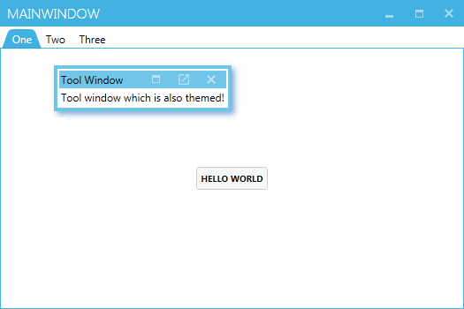
Any controls added to your Window (or Dragablz TabablzControl) will now default to MahApps styles, but use the Material Design palette, leaving your application looking pretty good. Having got to this point myself, I couldn’t help but start playing around a bit further with some Material Design. I created a list box with a few cards and the result looked pretty promising:

MaterialDesignEarlyPrototype

It wasn’t long before I went even further and started styling a whole bunch of controls, and ended up with these:

MaterialDesignDemo2

I’ve packaged all these themes (and will continue to add to) on NuGet:

Install-Package MaterialDesignThemes

Where appropriate in your app you can include one or more of the contained resource dictionaries and use the Material Design style for a control in place of the MahApps. All of your other controls will still use the MahApps themes, meaning your application should always look great. A thorough-bred mash-up 🙂

To select the appropriate resource dictionary and style name the best thing to do is download the source/demo solution from GitHub and run the two projects in the solution:

  • MahMaterialDragablzMashUp
  • MaterialDesignColors.WpfExample

Or, take a look at this MainWindow.cs.

Hope that all helps you get a good looking application up and running quickly!

As an end note I must mention this great piece of styling in WinForms, which inspired me to create the Material Design theme for Dragablz in the first place.

Uncategorized

Dragablz Meets MahApps, pt II.

In a previous post I showed Dragablz and MahApps working together with a few basic pointers.  In this post I will illustrate the specific MahApps styles included in Dragablz, and show how to get a basic app shell up and running using both libraries.

So, starting from scratch, create a new WPF Application in Visual Studio.  Throw a TabControl into your app.

<Window x:Class="WpfApplication1.MainWindow"
        xmlns="http://schemas.microsoft.com/winfx/2006/xaml/presentation"
        xmlns:x="http://schemas.microsoft.com/winfx/2006/xaml"
        xmlns:dragablz="clr-namespace:Dragablz;assembly=Dragablz"
        Title="MainWindow" Height="350" Width="525">
    <TabControl>
        <TabItem Header="One">
            <Button HorizontalAlignment="Center" VerticalAlignment="Center">Hello World</Button>
        </TabItem>
        <TabItem Header="Two">
            <Button HorizontalAlignment="Center" VerticalAlignment="Center">How are you doing</Button>
        </TabItem>
        <TabItem Header="Three">
            <Button HorizontalAlignment="Center" VerticalAlignment="Center">Goodbye</Button>
        </TabItem>
    </TabControl>
</Window>

If you fire it up, you’ll see it looks like tripe. And it’s static. To bring the tab control to life get Dragablz installed. Either from the Package Manager Console or the Manage Nuget Packages dialog install Dragablz.

Install-Package Dragablz

Switcheroo our boring old TabControl to the TabablzControl, and add an InterTabController property to let Dragablz know that the user can tear tabs out:

<Window x:Class="WpfApplication1.MainWindow"
        xmlns="http://schemas.microsoft.com/winfx/2006/xaml/presentation"
        xmlns:x="http://schemas.microsoft.com/winfx/2006/xaml"
        xmlns:dragablz="clr-namespace:Dragablz;assembly=Dragablz"
        Title="MainWindow" Height="350" Width="525">
    <dragablz:TabablzControl>
        <dragablz:TabablzControl.InterTabController>
            <dragablz:InterTabController />
        </dragablz:TabablzControl.InterTabController>
        <TabItem Header="One">
            <Button HorizontalAlignment="Center" VerticalAlignment="Center">Hello World</Button>
        </TabItem>
        <TabItem Header="Two">
            <Button HorizontalAlignment="Center" VerticalAlignment="Center">How are you doing</Button>
        </TabItem>
        <TabItem Header="Three">
            <Button HorizontalAlignment="Center" VerticalAlignment="Center">Goodbye</Button>
        </TabItem>
    </dragablz:TabablzControl>
</Window>

If you fire up the application now you should be able to tear the tabs out.

But it most definitely still looks rubbish. We need styles. Again, use your NuGet delivery mechanism of choice to bring in MahApps.Metro.

Install-Package MahApps.Metro

MahApps handy QuickStart guide should popup in Visual Studio. If it doesn’t, check here.  Follow the guide.  In summary we need to convert our Window to the MetroWindow, and add a include few ResourceDictionary instances in the App.xaml.

Fire the application up, take a look.  Things are improving:

MahApps Window with default-styled TabablzControl

We have a metro/modern UI Window and button.  But the tab control is yet to receive a makeover. You should already made the relevant MahApps ResourceDictionary inclusions in the App.xaml. Now we need to bring in the Dragablz ResourceDictionary which contains the MahApps styles, and specify the default style for the DragablzTabControl, giving you an App.xaml which looks like:

<Application x:Class="DMGMD.App"
             xmlns="http://schemas.microsoft.com/winfx/2006/xaml/presentation"
             xmlns:x="http://schemas.microsoft.com/winfx/2006/xaml"
             xmlns:dragablz="clr-namespace:Dragablz;assembly=Dragablz"
             StartupUri="MainWindow.xaml">
    <Application.Resources>
        <ResourceDictionary>
            <ResourceDictionary.MergedDictionaries>
                <ResourceDictionary Source="pack://application:,,,/MahApps.Metro;component/Styles/Controls.xaml" />
                <ResourceDictionary Source="pack://application:,,,/MahApps.Metro;component/Styles/Fonts.xaml" />
                <ResourceDictionary Source="pack://application:,,,/MahApps.Metro;component/Styles/Colors.xaml" />
                <ResourceDictionary Source="pack://application:,,,/MahApps.Metro;component/Styles/Accents/Blue.xaml" />
                <ResourceDictionary Source="pack://application:,,,/MahApps.Metro;component/Styles/Accents/BaseLight.xaml" />
                
                <ResourceDictionary Source="pack://application:,,,/Dragablz;component/themes/mahapps.xaml" />
            </ResourceDictionary.MergedDictionaries>
            
            <Style TargetType="{x:Type dragablz:TabablzControl}" BasedOn="{StaticResource MahAppsTabablzControlStyle}" />
            
        </ResourceDictionary>
    </Application.Resources>
</Application>

If you fire up the application you will see the tab control is now coloured according to the MahApps accent defined in the App.xaml.

MahApps Window with themed TabablzControl

As a bonus, let’s add a Dragablz tool window to the Window, which can also be themed with MahApps colours. Switch back to MainWindow.xml, wrap the TabablzControl in a Layout (notice the FloatingItemContainerStyle property), and add a simple floating item to the Layout:

<controls:MetroWindow x:Class="WpfApplication1.MainWindow"
        xmlns="http://schemas.microsoft.com/winfx/2006/xaml/presentation"
        xmlns:x="http://schemas.microsoft.com/winfx/2006/xaml"
        xmlns:dragablz="clr-namespace:Dragablz;assembly=Dragablz"
        xmlns:controls="http://metro.mahapps.com/winfx/xaml/controls"
        xmlns:dockablz="clr-namespace:Dragablz.Dockablz;assembly=Dragablz"
        Title="MainWindow" Height="350" Width="525">
    <dockablz:Layout FloatingItemHeaderMemberPath="Header" FloatingItemDisplayMemberPath="Content"
                     FloatingItemContainerStyle="{DynamicResource MahAppsToolDragablzItemStyle}">
        <dockablz:Layout.FloatingItems>
            <dragablz:HeaderedItemViewModel Header="Tool Window" Content="Tool window shich is also themed!" />
        </dockablz:Layout.FloatingItems>
        <dragablz:TabablzControl>
            <dragablz:TabablzControl.InterTabController>
                <dragablz:InterTabController />
            </dragablz:TabablzControl.InterTabController>
            <TabItem Header="One">
                <Button HorizontalAlignment="Center" VerticalAlignment="Center">Hello World</Button>
            </TabItem>
            <TabItem Header="Two">
                <Button HorizontalAlignment="Center" VerticalAlignment="Center">How are you doing</Button>
            </TabItem>
            <TabItem Header="Three">
                <Button HorizontalAlignment="Center" VerticalAlignment="Center">Goodbye</Button>
            </TabItem>
        </dragablz:TabablzControl>
    </dockablz:Layout>
</controls:MetroWindow>

And here will be your final result, a MahApps Window, ready for all your Metro/Modern UI content, which can also support tear-able tabs, tool windows, and docking!

dragablzandmahappstutorial_03

In a future post I will illustrate how to add and remove tabs, and work in a MVVM environment.

.Net, C#, Material Design, UI, UX, WinApi, WPF, xaml

How to use the Material Design theme with Dragablz Tab Control

In this post I will demonstrate how to – very quickly – combine Dragablz and MaterialDesignColors in WPF to create a great looking control which supports full tear out and can use the Google Material Design colour palette.

Dragablz Tab Contrtol and Material Design

Start a new WPF project.  We rely on two NuGet packages, so get them installed straight away.  Install from the Package Manager tool in Visual Studio, or, from the NuGet console run these commands:

Install-Package Dragablz
Install-Package MaterialDesignColors

In the MainWindow.xaml, setup a simple usage of Dragablz TabablzControl:

<Window x:Class="MaterialDesignTabExample.MainWindow"
        xmlns="http://schemas.microsoft.com/winfx/2006/xaml/presentation"
        xmlns:x="http://schemas.microsoft.com/winfx/2006/xaml"
        xmlns:dragablz="clr-namespace:Dragablz;assembly=Dragablz"
        Title="Material Design Demo" Height="350" Width="525">
    <dragablz:TabablzControl>
        <dragablz:TabablzControl.InterTabController>
            <dragablz:InterTabController />
        </dragablz:TabablzControl.InterTabController>
        <TabItem Header="HELLO">
            <TextBlock HorizontalAlignment="Center" VerticalAlignment="Center">Hello World</TextBlock>
        </TabItem>
        <TabItem Header="MATERIAL">
            <TextBlock HorizontalAlignment="Center" VerticalAlignment="Center">Material Design</TextBlock>
        </TabItem>
        <TabItem Header="DESIGN">
            <TextBlock HorizontalAlignment="Center" VerticalAlignment="Center">Looks Quite Nice</TextBlock>
        </TabItem>
    </dragablz:TabablzControl>
</Window>

Already if you run this project you will have a tab control that supports Chrome-style tearing out of tabs. But it wont look too good. So, the next step is to bring in the Material Design colours, and tell Dragablz to use the Material Design style.

Open up your App.xaml. We have to merge in three dictionaries.  The first two are to set up your Material Design colour palette.  The MaterialDesignColors assembly contains a ResourceDictionary for each color (a collection of hues and accents).  To create a full palette we need to bring in a primary colour, set up some hue brushes, and then bring in a secondary color for our accent color.  The third resource dictionary is to include the Dragablz theme for Material Design.  Finally we instruct our tab control to use the correct style.

Don’t worry, it’s not too complicated.  The full App.xaml is below:

<Application x:Class="MaterialDesignColors.WpfExample.App"
             xmlns="http://schemas.microsoft.com/winfx/2006/xaml/presentation"
             xmlns:x="http://schemas.microsoft.com/winfx/2006/xaml"
             xmlns:dragablz="clr-namespace:Dragablz;assembly=Dragablz"
             StartupUri="MainWindow.xaml">
    <Application.Resources>
        <ResourceDictionary>
            <ResourceDictionary.MergedDictionaries>
                <!-- primary color -->
                <ResourceDictionary>
                    <!-- include your primary palette -->
                    <ResourceDictionary.MergedDictionaries>
                        <ResourceDictionary Source="pack://application:,,,/MaterialDesignColors;component/Themes/MaterialDesignColor.Indigo.xaml" />
                    </ResourceDictionary.MergedDictionaries>
                    <!--
                            include three hues from the primary palette (and the associated forecolours).
                            Do not rename, keep in sequence; light to dark.
                        -->
                    <SolidColorBrush x:Key="PrimaryHueLightBrush" Color="{StaticResource Primary100}"/>
                    <SolidColorBrush x:Key="PrimaryHueLightForegroundBrush" Color="{StaticResource Primary100Foreground}"/>
                    <SolidColorBrush x:Key="PrimaryHueMidBrush" Color="{StaticResource Primary500}"/>
                    <SolidColorBrush x:Key="PrimaryHueMidForegroundBrush" Color="{StaticResource Primary500Foreground}"/>
                    <SolidColorBrush x:Key="PrimaryHueDarkBrush" Color="{StaticResource Primary700}"/>
                    <SolidColorBrush x:Key="PrimaryHueDarkForegroundBrush" Color="{StaticResource Primary700Foreground}"/>
                </ResourceDictionary>

                <!-- secondary colour -->
                <ResourceDictionary>
                    <!-- include your secondary pallette -->
                    <ResourceDictionary.MergedDictionaries>
                        <ResourceDictionary Source="pack://application:,,,/MaterialDesignColors;component/Themes/MaterialDesignColor.Yellow.xaml" />
                    </ResourceDictionary.MergedDictionaries>

                    <!-- include a single secondary accent color (and the associated forecolour) -->
                    <SolidColorBrush x:Key="SecondaryAccentBrush" Color="{StaticResource Accent200}"/>
                    <SolidColorBrush x:Key="SecondaryAccentForegroundBrush" Color="{StaticResource Accent200Foreground}"/>
                </ResourceDictionary>

                <!-- Include the Dragablz Material Design style -->
                <ResourceDictionary Source="pack://application:,,,/Dragablz;component/Themes/materialdesign.xaml"/>                

            </ResourceDictionary.MergedDictionaries>

            <!-- tell Dragablz tab control to use the Material Design theme -->
            <Style TargetType="{x:Type dragablz:TabablzControl}" BasedOn="{StaticResource MaterialDesignTabablzControlStyle}" />
        </ResourceDictionary>
    </Application.Resources>
</Application>

And that’s it. Fire up your baby and you are done. You can change the colours by changing the two colour resource dictionaries which are referenced. You can also tweak the hues, but do not change the brush names.  Dragablz will be looking for these.

Links:

Enjoy!

.Net, C#, UI, WPF

MDI in WPF via Dragablz

Dragablz is more than just a Chrome style TabControl for WPF.  Via it’s Layout control it provides docking and tool windows.  Taking the tool windows a step further, they can be used to provide an MDI effect in WPF.  Even better, the MDI environment can reside inside a tab, which, when coupled with Dragablz other tear out and docking features can provide very rich UI Window management for the user.

There’s a couple of properties of the Layout control to consider:

  • FloatingItems – allows any items to be floated on top of the Layout’s content.
  • FloatingItemsSource – allows any items to be floated on top of the Layout’s content.

And a selection of RoutedCommand’s to help out with management of items floated on the Layout:

  • UnfloatItemCommand –
  • MaximiseFloatingItem
  • RestoreFloatingItem
  • TileFloatingItemsCommand
  • TileFloatingItemsVerticallyCommand
  • TileFloatingItemsHorizontallyCommand

Here’s a snippet of an MDI layout from the Dragablz demo on GitHub:

<DockPanel>
    <StackPanel DockPanel.Dock="Top" Orientation="Horizontal">
        <Button Command="{x:Static dockablz:Layout.TileFloatingItemsCommand}"
                CommandTarget="{Binding ElementName=MdiLayout}">Tile Grid</Button>
        <Button Command="{x:Static dockablz:Layout.TileFloatingItemsVerticallyCommand}"
                CommandTarget="{Binding ElementName=MdiLayout}">Tile Horizontal</Button>
        <Button Command="{x:Static dockablz:Layout.TileFloatingItemsHorizontallyCommand}"
                CommandTarget="{Binding ElementName=MdiLayout}">Tile Vertical</Button>
    </StackPanel>
    <dockablz:Layout x:Name="MdiLayout" 
                     FloatingItemHeaderMemberPath="Name"
                     FloatingItemDisplayMemberPath="SimpleContent">            
        <dockablz:Layout.FloatingItems>                
            <dragablzDemo:SimpleViewModel Name="One" SimpleContent="MDI Child One" />                
            <dragablzDemo:SimpleViewModel Name="Two" SimpleContent="MDI Child Two" />                
            <dragablzDemo:SimpleViewModel Name="Three" SimpleContent="MDI Child Three" />
        </dockablz:Layout.FloatingItems>
    </dockablz:Layout>
</DockPanel>

And to illustrate what’s achievable, here’s an MDI layout, inside a tear-able tab:

MDI, operating within a tab.

Links to Dragablz:

.Net, C#, UI, WPF

Dragablz Meets MahApps

Dragablz is getting quite feature rich now, so I have created a demo project to illustrate it in use with another UI library, MahApps.  If you haven’t used MahApps with WPF, it’s a great Metro/ModernUI style and control library to bring your apps bang up to date.

Off the bat, if you are going to use Dragablz and MahApps together you will have to make a decision: use the MahApps MetroWindow, or the Dragablz DragablzWindow (or indeed your own)?

Each option has its advantages.  Primarily; MetrowWindow is a rich Window, with flyouts & custom Window commands, and the DragablzWindow supports transparency to provide a better dragging effect.  See the two gifs for illustration of this point.

Code and XAML-wise there is very little difference.  The demo project on GitHub shows that very little change is required to use Dragablz and MahApps together regardless of how you choose to do it.

Download the project, build it in Visual Studio, and run both applications (DragablzWindowApp & MahAppsWindowApp).  You will see the differences illustrated above, and you will also see very little difference in the XAML required.  The MainWindow.xaml file for each project is almost identical:

It’s also worth checking out the app.xaml to illustrate some of the styling info required.


.Net, C#, UI, WinApi, WPF

Getting Windows Snap to Play with WPF Borderless Windows

In making the Dragablz library I quickly realised I needed be able to push the tabs higher up the window as we see in Chrome, and also, to achieve the IE affect, I really needed Window transparency. Therefore I introduced DragablzWindow.

DragablzWindowSnap

The easiest way to do the above is set the WindowStyle to None. But this has immediate draw backs: no dragging and resizing. Getting the dragging up and running is pretty easy and well illustrated on the web:

MouseLeftButtonDown += (s, e) => DragMove();

But this only partially works with Windows Snap. The Window will snap; left, right, top/maximised. But you cant drag the maximised window down to restore it.

Snap Attack

So I had to blend some aspects of WPF and WinApi to achieve the full effect.

In the XAML template for DragablzWindow I placed a Thumb control behind the content. Note how the hit test is off:

<Thumb Style="{StaticResource InvisibleThumbStyle}"
       IsHitTestVisible="False"
       x:Name="PART_WindowRestoreThumb"/>
<ContentPresenter Margin="4"/>

The hit test is off so it doesn’t interfere with our DragMove. Until the Window becomes maximised. Once the Window becomes maximised we enable the thumb and listen to it’s drag delta. Monitoring the drag delta is where we perform our trick, sending a Windows message to restart the drag as usual, handing back off the Thumb, to an Api instigated drag. Basically a slight re-working of what happens inside Windows.DragMove:

private void WindowMoveThumbOnDragDelta(object sender, DragDeltaEventArgs dragDeltaEventArgs)
{
    if (WindowState != WindowState.Maximized ||
        (!(Math.Abs(dragDeltaEventArgs.HorizontalChange) > 2) &&
         !(Math.Abs(dragDeltaEventArgs.VerticalChange) > 2))) return;

    WindowState = WindowState.Normal;
    Native.SendMessage(CriticalHandle, WindowMessage.WM_LBUTTONUP, IntPtr.Zero, IntPtr.Zero);
    Native.SendMessage(CriticalHandle, WindowMessage.WM_SYSCOMMAND, (IntPtr)SystemCommand.SC_MOUSEMOVE, IntPtr.Zero);
}

Try this on for Resize

To make the Window resizable we get back to the WPF side of things, using another Thumb, this time laid over the content (instead of under). Applying a custom clip, we can make the thumb only hit-able around the border of the Window, leaving the behaviour of the remaining content intact:

protected override void OnRenderSizeChanged(SizeChangedInfo sizeInfo)
{
    var resizeThumb = GetTemplateChild(WindowResizeThumbPartName) as Thumb;
    if (resizeThumb != null)
    {
        var outerRectangleGeometry = new RectangleGeometry(new Rect(sizeInfo.NewSize));
        var innerRectangleGeometry =
            new RectangleGeometry(new Rect(ResizeMargin, ResizeMargin, sizeInfo.NewSize.Width - ResizeMargin * 2, sizeInfo.NewSize.Height - ResizeMargin*2));
        resizeThumb.Clip = new CombinedGeometry(GeometryCombineMode.Exclude, outerRectangleGeometry,
            innerRectangleGeometry);
    }

    base.OnRenderSizeChanged(sizeInfo);
}

We must now handle the sizing manually, based on how the user drags the thumb around. It’s worth seeing the source code to see how that’s handled.

The Result

A Window which supports:

  • Transparancy
  • Dragging
  • Resizing
  • Snapping
  • And, all of the cool tab features of Dragablz!

DragablzWindowSnap

Source Code

The DragablzWindow is part of the Dragablz project on GitHub. And the style is here.


Uncategorized

The ‘IE’ Effect

Dragablz now provides its own window, “DragablzWindow”. Please note, it is not mandatory – and is still very much a work in progress!

What the Window will provide, is the ability to push the tabs up a bit, and even better, whatever padding is around the tab can become transparent whilst a tab is being dragged around, in a similar vein to IE. Check out the gif:

TransparancyOnDragableWindows

.Net, C#, UI, WPF

Tool Window Enhancements

Time for another quick look at what’s happening with tool windows in Dragablz.

You can now take a tab, tear it out, and then drop it straight back in, but as a tool window…neat!  The tool window can then be popped out, back into a first class window and tab control of it’s own.

DragInAndOutOfToolWindows

At some point I will try and get floating tabs on the tool window layer, so you can organise even further, but still in the user-friendly manner I am trying to push in Dragablz.

Also, soon I hope to create a nice demo app mixing in a Modern UI theme courtesy of MahApps, demonstrating how to really re-ignite the power of desktop apps, so keep an eye out.

If you like this library please help motivate me and star it on GitHub!

.Net, C#, UI, WPF

Quick Look at Tool Windows

The Dragablz feature set is come together nicely now, it’s more than just a Chrome style tear out tab control.  Much more.  I just quickly wanted to provide a look at the way the DragablzItemsControl can be used to generate a tool window effect.   As always, there’s more to come!

Tool Windows
Tool Windows
.Net, C#, UI, Uncategorized, WPF

User Friendly Docking With Dockablz

We all have our favourite IDE, and they all provide pretty advanced docking features. Many control libraries in WinForms, WPF, Swing etc have provided this functionality over the years. But are docking suites – which can be complex, fiddly beasts – designed by and for developers what other users really want?

Remember when Google first released Chrome? Tearing tabs out immediately felt so easy and natural I wondered why no-one had done it before. It was one of those UX paradigms that just works. So in designing the docking library for Dragablz I wanted to reduce the complexity of what we have come to expect and provide a UX experience that is much more easy and free flowing. I’ve tried this before on an enterprise application I have been working on and it’s pretty successful with the user base.

The gif below illustrates the simplicity of having quick, easy access dock “zones” that are easy to throw a tab into, instead of having more, smaller, fiddly areas which are harder to hit in traditional setups.

Easy Docking With Dockablz

There’s still a little way to go to polish up the code but the basics can be seen in the demo project in the main solution in GitHub.