Well, this project kinda came out of nowhere, but has proven to be pretty popular and I’ve really enjoyed getting it to this state: version 1.0! It’s officially a non-alpha, non-beta, totally live thing!!
I’ve cranked up my contributions over the last month to push it over the line for its for first official release, recently adding runtime palette switching via the PaletteHelper/Swatch API, a new ColorZone control to help you design your layouts, and more granular control of ripples and shadows. A few styles and animations have also been tweaked to really improve the look and feel.
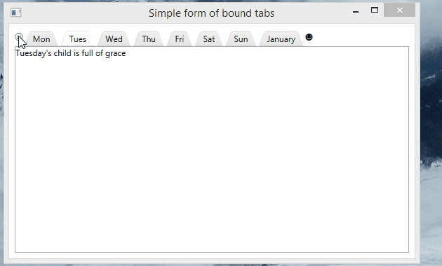
To go with version one I’ve completely re-worked the demo app, as illustrated in the video. It’s really worth checking, it might just give you some inspiration for your WPF apps!
And if you haven’t seen I recently launched a new home page for the project: materialdesigninxaml.net, which includes a Get Started section.
There’s still plenty more to come for both Material Design In XAML and Dragablz but I will be treating myself to a little break for a week or two!
Finally, after a couple of years of take, take, take; I’ve made a contribution to MahApps. Working in a financial institution it’s not always easy to commit back to open source projects, so with a little bit of out-of-hours work I’ve solved a little problem I’ve seen a few people asking: “how do you use MahApps dialog boxes in an MVVM setup?” And now my conscience is clear. 😉
Now You Can Launch a Dialog Box From a View Model.
There’s a couple of simple things you have to do:
1) Use an attached property in your Window to register your view model with the dialog sub-system.
Assuming your View’s DataContext is set to the view model from where you want to launch the dialog, add these attributes:
You can instantiate DialogCoordinator directly, or, good citizens will probably want to inject in the interface IDialogCoordinator into their view model. This will play nicely with TDD, and is agnostic to whatever DI framework you may be using.
Without a DI framework you could just do something like this:
new MainWindowViewModel(DialogCoordinator.Instance);
Opening up a dialog from your view model is now easy, using the IDialogCoordinator instance. To most methods the first parameter named “context” will typically be your view model. This is how the coordinator will match the view model to the window (with what was registered in step 1) and display the dialog. If you have multiple windows open, the dialog will display on the correct window. Show your dialog from inside your view model just like this:
_dialogCoordinator.ShowMessageAsync(this, "Message from VM", "MVVM based dialogs!")
If you want to see this in action and follow the code through open up the MahApps MetroDemo project (part of the MahApps source code), and launch from the “Dialogs” Menu:
But the fun part was cranking a couple of brand new controls to build the Material Design time picker experience:
TimePicker
Clock
These are sibling controls to the existing DatePicker and Calendar controls. I wanted to keep the API experience similar so you can dive straight in without any kind of learning curve. The Clock can be used in isolation, or use the DatePicker for an easy picker/popup/drop down behaviour.
Here’s a static glimpse at the picker:
And here’s a gif of the clock in action:
There’s nothing complicated about using these, but you will need to get Material Design In XAML Toolkit referenced and set up in your app. Follow the initial tutorial, and head over to GitHub to download the source/examples project.
Material Design templates for DatePicker/Calendar primitive controls.
Please note that the behaviour is not quite identical to that which you might see on Android. These are templates for the existing WPF DatePicker and Calendar primitive controls, and thus, some of the behaviour around month/year selection is driven by the nature of those controls. There is no modal dialog, as I don’t want these templates to get confused with any requirement/API used to manage dialogs in WPF.
I must say that I believe that it is testament to the original design of WPF/XAML – which is now a mature technology – that I could slot these styles in pretty much seamlessly for a control whose code base is around 8 years old. Note that some extra code has gone in to the Material Design Toolkit, bit this is wrapped inside the new templates and thus if you consume these templates you need never concern yourself with it.
I have previously posted about the Material Design theme for Dragablz. In this post I will describe how I arrived at this application mock-up, by combining Dragablz, Material Design in XAML Toolkit, and MahApps:
Material Design Demo
My initial task when creating that style was to create a separate, and composable way to define the Material Design colour palette for your application. Making the separation between the colours and the Dragablz Material Design theme immediately paid benefit. Being a big fan of MahApps and I was easily able to take things a step further and use the palette in conjunction with a MahApps MetroWindow. Encouraging MahApps to pick up my Material Design palette turned out to be easy because of the way the MahApps guys had also separated out their accents. Very quickly, I had a MahApps MetroWindow up and running, using MahApps themed controls, the Dragablz Material Design theme, and all of which were using the Material Design palette. It looked pretty good straight away.
I’ve previously posted on how to choose a Material Design palette, but for a refresher, take a look at this App.xaml.
In addition to the Material Design palette, you need to set a base theme; light or dark. So add this resource dictionary to your App.xaml:
Getting MahApps to use the Material Design palette only takes a few extra lines in your App.xaml. Firstly, merge in some of the usual MahApps dictionaries:
Then, where you specify the primary Material Design colour, setup the MahApps brushes, but instead of pulling in one of the MahApps accent dictionaries, configure them manually, to use the Material Design palette:
Any controls added to your Window (or Dragablz TabablzControl) will now default to MahApps styles, but use the Material Design palette, leaving your application looking pretty good. Having got to this point myself, I couldn’t help but start playing around a bit further with some Material Design. I created a list box with a few cards and the result looked pretty promising:
It wasn’t long before I went even further and started styling a whole bunch of controls, and ended up with these:
I’ve packaged all these themes (and will continue to add to) on NuGet:
Install-Package MaterialDesignThemes
Where appropriate in your app you can include one or more of the contained resource dictionaries and use the Material Design style for a control in place of the MahApps. All of your other controls will still use the MahApps themes, meaning your application should always look great. A thorough-bred mash-up 🙂
To select the appropriate resource dictionary and style name the best thing to do is download the source/demo solution from GitHub and run the two projects in the solution:
Hope that all helps you get a good looking application up and running quickly!
As an end note I must mention this great piece of styling in WinForms, which inspired me to create the Material Design theme for Dragablz in the first place.
In this post I will demonstrate how to – very quickly – combine Dragablz and MaterialDesignColors in WPF to create a great looking control which supports full tear out and can use the Google Material Design colour palette.
Dragablz Tab Contrtol and Material Design
Start a new WPF project. We rely on two NuGet packages, so get them installed straight away. Install from the Package Manager tool in Visual Studio, or, from the NuGet console run these commands:
Already if you run this project you will have a tab control that supports Chrome-style tearing out of tabs. But it wont look too good. So, the next step is to bring in the Material Design colours, and tell Dragablz to use the Material Design style.
Open up your App.xaml. We have to merge in three dictionaries. The first two are to set up your Material Design colour palette. The MaterialDesignColors assembly contains a ResourceDictionary for each color (a collection of hues and accents). To create a full palette we need to bring in a primary colour, set up some hue brushes, and then bring in a secondary color for our accent color. The third resource dictionary is to include the Dragablz theme for Material Design. Finally we instruct our tab control to use the correct style.
Don’t worry, it’s not too complicated. The full App.xaml is below:
<Application x:Class="MaterialDesignColors.WpfExample.App"
             xmlns="http://schemas.microsoft.com/winfx/2006/xaml/presentation"
             xmlns:x="http://schemas.microsoft.com/winfx/2006/xaml"
             xmlns:dragablz="clr-namespace:Dragablz;assembly=Dragablz"
             StartupUri="MainWindow.xaml">
    <Application.Resources>
        <ResourceDictionary>
            <ResourceDictionary.MergedDictionaries>
                <!-- primary color -->
                <ResourceDictionary>
                    <!-- include your primary palette -->
                    <ResourceDictionary.MergedDictionaries>
                        <ResourceDictionary Source="pack://application:,,,/MaterialDesignColors;component/Themes/MaterialDesignColor.Indigo.xaml" />
                    </ResourceDictionary.MergedDictionaries>
                    <!--
                            include three hues from the primary palette (and the associated forecolours).
                            Do not rename, keep in sequence; light to dark.
                        -->
                    <SolidColorBrush x:Key="PrimaryHueLightBrush" Color="{StaticResource Primary100}"/>
                    <SolidColorBrush x:Key="PrimaryHueLightForegroundBrush" Color="{StaticResource Primary100Foreground}"/>
                    <SolidColorBrush x:Key="PrimaryHueMidBrush" Color="{StaticResource Primary500}"/>
                    <SolidColorBrush x:Key="PrimaryHueMidForegroundBrush" Color="{StaticResource Primary500Foreground}"/>
                    <SolidColorBrush x:Key="PrimaryHueDarkBrush" Color="{StaticResource Primary700}"/>
                    <SolidColorBrush x:Key="PrimaryHueDarkForegroundBrush" Color="{StaticResource Primary700Foreground}"/>
                </ResourceDictionary>

                <!-- secondary colour -->
                <ResourceDictionary>
                    <!-- include your secondary pallette -->
                    <ResourceDictionary.MergedDictionaries>
                        <ResourceDictionary Source="pack://application:,,,/MaterialDesignColors;component/Themes/MaterialDesignColor.Yellow.xaml" />
                    </ResourceDictionary.MergedDictionaries>

                    <!-- include a single secondary accent color (and the associated forecolour) -->
                    <SolidColorBrush x:Key="SecondaryAccentBrush" Color="{StaticResource Accent200}"/>
                    <SolidColorBrush x:Key="SecondaryAccentForegroundBrush" Color="{StaticResource Accent200Foreground}"/>
                </ResourceDictionary>

                <!-- Include the Dragablz Material Design style -->
                <ResourceDictionary Source="pack://application:,,,/Dragablz;component/Themes/materialdesign.xaml"/>

            </ResourceDictionary.MergedDictionaries>

            <!-- tell Dragablz tab control to use the Material Design theme -->
            <Style TargetType="{x:Type dragablz:TabablzControl}" BasedOn="{StaticResource MaterialDesignTabablzControlStyle}" />
        </ResourceDictionary>
    </Application.Resources>
</Application>
And that’s it. Fire up your baby and you are done. You can change the colours by changing the two colour resource dictionaries which are referenced. You can also tweak the hues, but do not change the brush names. Dragablz will be looking for these.
Dragablz is more than just a Chrome style TabControl for WPF. Via it’s Layout control it provides docking and tool windows. Taking the tool windows a step further, they can be used to provide an MDI effect in WPF. Even better, the MDI environment can reside inside a tab, which, when coupled with Dragablz other tear out and docking features can provide very rich UI Window management for the user.
There’s a couple of properties of the Layout control to consider:
FloatingItems – allows any items to be floated on top of the Layout’s content.
FloatingItemsSource – allows any items to be floated on top of the Layout’s content.
And a selection of RoutedCommand’s to help out with management of items floated on the Layout:
Dragablz is getting quite feature rich now, so I have created a demo project to illustrate it in use with another UI library, MahApps. If you haven’t used MahApps with WPF, it’s a great Metro/ModernUI style and control library to bring your apps bang up to date.
Off the bat, if you are going to use Dragablz and MahApps together you will have to make a decision: use the MahApps MetroWindow, or the Dragablz DragablzWindow (or indeed your own)?
Each option has its advantages. Primarily; MetrowWindow is a rich Window, with flyouts & custom Window commands, and the DragablzWindow supports transparency to provide a better dragging effect. See the two gifs for illustration of this point.
Code and XAML-wise there is very little difference. The demo project on GitHub shows that very little change is required to use Dragablz and MahApps together regardless of how you choose to do it.
Download the project, build it in Visual Studio, and run both applications (DragablzWindowApp & MahAppsWindowApp). You will see the differences illustrated above, and you will also see very little difference in the XAML required. The MainWindow.xaml file for each project is almost identical:
In making the Dragablz library I quickly realised I needed be able to push the tabs higher up the window as we see in Chrome, and also, to achieve the IE affect, I really needed Window transparency. Therefore I introduced DragablzWindow.
The easiest way to do the above is set the WindowStyle to None. But this has immediate draw backs: no dragging and resizing. Getting the dragging up and running is pretty easy and well illustrated on the web:
MouseLeftButtonDown += (s, e) => DragMove();
But this only partially works with Windows Snap. The Window will snap; left, right, top/maximised. But you cant drag the maximised window down to restore it.
Snap Attack
So I had to blend some aspects of WPF and WinApi to achieve the full effect.
In the XAML template for DragablzWindow I placed a Thumb control behind the content. Note how the hit test is off:
The hit test is off so it doesn’t interfere with our DragMove. Until the Window becomes maximised. Once the Window becomes maximised we enable the thumb and listen to it’s drag delta. Monitoring the drag delta is where we perform our trick, sending a Windows message to restart the drag as usual, handing back off the Thumb, to an Api instigated drag. Basically a slight re-working of what happens inside Windows.DragMove:
To make the Window resizable we get back to the WPF side of things, using another Thumb, this time laid over the content (instead of under). Applying a custom clip, we can make the thumb only hit-able around the border of the Window, leaving the behaviour of the remaining content intact:
protected override void OnRenderSizeChanged(SizeChangedInfo sizeInfo)
{
    var resizeThumb = GetTemplateChild(WindowResizeThumbPartName) as Thumb;
    if (resizeThumb != null)
    {
        var outerRectangleGeometry = new RectangleGeometry(new Rect(sizeInfo.NewSize));
        var innerRectangleGeometry =
            new RectangleGeometry(new Rect(ResizeMargin, ResizeMargin, sizeInfo.NewSize.Width - ResizeMargin * 2, sizeInfo.NewSize.Height - ResizeMargin*2));
        resizeThumb.Clip = new CombinedGeometry(GeometryCombineMode.Exclude, outerRectangleGeometry,
            innerRectangleGeometry);
    }

    base.OnRenderSizeChanged(sizeInfo);
}
We must now handle the sizing manually, based on how the user drags the thumb around. It’s worth seeing the source code to see how that’s handled.
Time for another quick look at what’s happening with tool windows in Dragablz.
You can now take a tab, tear it out, and then drop it straight back in, but as a tool window…neat! The tool window can then be popped out, back into a first class window and tab control of it’s own.
At some point I will try and get floating tabs on the tool window layer, so you can organise even further, but still in the user-friendly manner I am trying to push in Dragablz.
Also, soon I hope to create a nice demo app mixing in a Modern UI theme courtesy of MahApps, demonstrating how to really re-ignite the power of desktop apps, so keep an eye out.
If you like this library please help motivate me and star it on GitHub!


 dragablz.net