There’s plenty progress loop controls around for WPF, but for Material Design In XAML Toolkit I really wanted to stick to “themeing” existing framework controls where-ever possible. Here’s examples of what were trying to achieve from Google’s own documentation, if you have an Android phone you’ll no doubt have seen these in action:
Before I tackled the style I spent a few weeks bouncing ideas around in my head. To create the circular effect we’d have to dust off the trigonometry but I really wasn’t sure if I cold pull it all off inside a WPF Style, without creating a new control, or at least inheriting (yuck) from ProgressBar. ProgressBar says it all. It wasn’t really designed to go where I wanted it to go and whilst weighing things up I reflected into the ProgressBar.cs source:
//----------------------------------------------------------------------------
// File: ProgressBar.cs
//
// Description:
// Implementation of ProgressBar control.
//
// History:
// 06/28/2004 - t-sergin - Created
//
// Copyright (C) 2004 by Microsoft Corporation. All rights reserved.
//
//---------------------------------------------------------------------------
Okaaaayyy…so using the ever flexible WPF we are still taking something from 2004 and trying to theme it using 2015 design trends. Should be fun! There are a few TemplatePart’s which the code it expects – to draw a standard bar – but fortunately the control is also gracious enough to operate without them.
To create the looping progress ring thingy a simple arc path should do the job:
<Path>
  <Path.Data>
    <PathGeometry>
      <PathFigure StartPoint="?">
        <ArcSegment Size="?" IsLargeArc="?" Point="?" SweepDirection="Clockwise" />
      </PathFigure>
    </PathGeometry>
  </Path.Data>
</Path>
But you’ll see from the attributes with a ? we’ve got 4 values we’ve got to complete:
- PathFigure.StartPoint: pretty simple, start the arc at the top, on the middle of the X axis
- ArcSegment.Size: easy again, this is the radius, so half the size of the control
- ArcSegment.IsLargeArc: to draw anything over 180deg, this needs to be set to true. We’ll need a multiple values to figure out if we are over half way through progress: ProgressBar.Minumum, .Maximum, .Value
- ArcSegment.Point: This is where from the StartPoint we need to draw our arc around to. Again we’ll need ProgressBar.Minumum, .Maximum, .Value, and with the wonders of trigonometry we can figure this out.
No worries though, we can wrap all of these little calculations in a bunch of IValueConverter and IMultiValueConverter implementations. In reality then, bending a straight progress bar into a circle is pretty simple. The PathFigure – now, peppered with a bunch of value converters – looks a bit like this:
<PathFigure StartPoint="{Binding ElementName=PathGrid, Path=ActualWidth, Converter={StaticResource StartPointConverter}, Mode=OneWay}">
<ArcSegment Size="{Binding ElementName=PathGrid, Path=ActualWidth, Converter={StaticResource ArcSizeConverter}, Mode=OneWay}" SweepDirection="Clockwise">
<ArcSegment.IsLargeArc>
<MultiBinding Converter="{StaticResource LargeArcConverter}">
<Binding RelativeSource="{RelativeSource TemplatedParent}" Path="Value" />
<Binding RelativeSource="{RelativeSource TemplatedParent}" Path="Minimum" />
<Binding RelativeSource="{RelativeSource TemplatedParent}" Path="Maximum" />
<Binding ElementName="FullyIndeterminateGridScaleTransform" Path="ScaleX" />
</MultiBinding>
</ArcSegment.IsLargeArc>
<ArcSegment.Point>
<MultiBinding Converter="{StaticResource ArcEndPointConverter}">
<Binding ElementName="PathGrid" Path="ActualWidth" />
<Binding RelativeSource="{RelativeSource TemplatedParent}" Path="Value" />
<Binding RelativeSource="{RelativeSource TemplatedParent}" Path="Minimum" />
<Binding RelativeSource="{RelativeSource TemplatedParent}" Path="Maximum" />
<Binding ElementName="FullyIndeterminateGridScaleTransform" Path="ScaleX" />
</MultiBinding>
</ArcSegment.Point>
</ArcSegment>
</PathFigure>
(I don’t think WordPress wants to format that…)
We’re not done there though. Material Design has extra animation flourishes to provide the extra pzazz. If you look at the determinate loop in the video above, you’ll see that the whole ring is rotating in addition to drawing out the arc representing completion. Something, a bit like this:
By applying a RotateTransform to the Path itself, and using yet another converter to calculate the rotation according to the percent of completion we can pretty close to the Google effect.
<Path.RenderTransform>
<TransformGroup>
<RotateTransform x:Name="RotateTransform" CenterX="{Binding ElementName=PathGrid, Path=ActualWidth, Converter={StaticResource RotateTransformCentreConverter}, Mode=OneWay}" CenterY="{Binding ElementName=PathGrid, Path=ActualWidth, Converter={StaticResource RotateTransformCentreConverter}, Mode=OneWay}">
<RotateTransform.Angle>
<MultiBinding Converter="{StaticResource RotateTransformConverter}">
<Binding RelativeSource="{RelativeSource TemplatedParent}" Path="Value" />
<Binding RelativeSource="{RelativeSource TemplatedParent}" Path="Minimum" />
<Binding RelativeSource="{RelativeSource TemplatedParent}" Path="Maximum" />
</MultiBinding>
</RotateTransform.Angle>
</RotateTransform>
</TransformGroup>
</Path.RenderTransform>
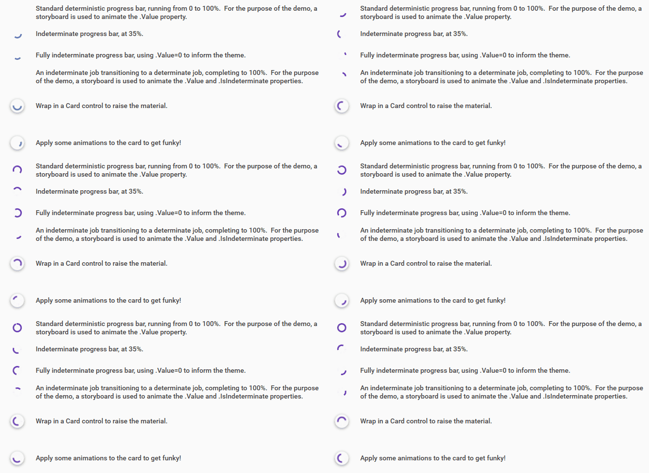
I’ve actually built further animation storyboards on top of this to try and get close to the indeterminate effect. It’s not quite perfect yet, but close enough for what I released in version 1.0 of Material Design In XAML Toolkit. Here’s a gif of how things were looking in that release:
And, in keeping with my original challenge of staying close to the original .Net Framework controls, usage is pretty straight forward:
<ProgressBar Style="{StaticResource MaterialDesignCicularProgressBar}" Value="50" />
To see it in action run up the demo project which is part of the main source.
The actual final style can be found here:
And – as there are a whole bunch of converters – they warrant their own namespace here:


